This series of articles is about Ofsted’s Inspection Data Summary Report (IDSR).
The previous article was about Early Years Reading, Writing and Maths Analysis and Phonics.
This article is about the attainment charts contained in Key Stages 1 and 2, using Key Stage 1 as an example.
Key Stage 1 charts

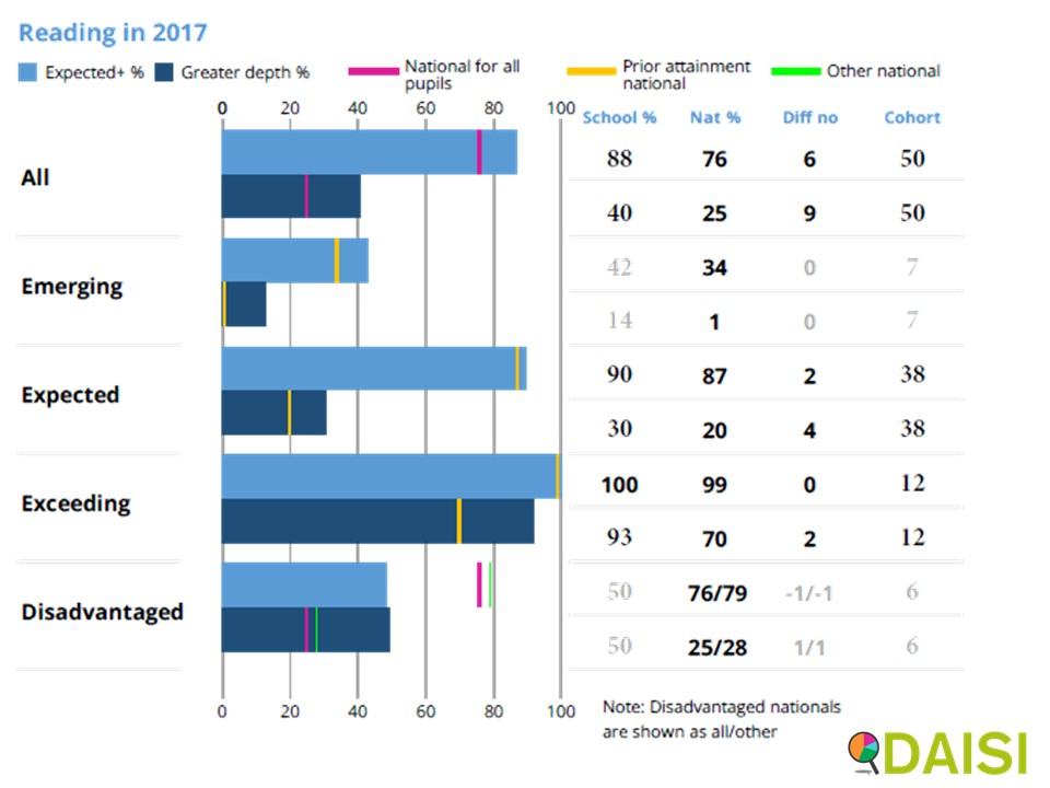
The Key Stage 1 charts are for Reading, Writing and Maths. Your school’s results are still the bars, but this time they are going across instead of down. For all cohorts there are:
- the lighter blue bars, which is the Expected Standard or above, and
- the darker blue bars, which is the Greater Depth standard.
Your pupils are divided into five different cohorts:
- All pupils are being compared with the National All Pupils average – 76% (Expected Standard or above) and 25% (Greater Depth standard).
Emerging, Expected and Exceeding cohorts
For Key Stage 1, it also includes the following:
- Emerging – pupils who got the Emerging assessment in the Early Years for reading;
- Expected – pupils who got the Expected assessment in Early Years; and
- Exceeding – pupils who got the Exceeding assessment.
The IDSR for Key Stage 1 has charts for Reading, for Writing and for Maths:
- “Emerging” in the Key Stage 1 Reading chart represents those pupils who got Emerging in Reading in Early Years.
- “Emerging” in the Writing charts represents those pupils who got Emerging in Writing in Early Years.
The “Emerging” cohort in Reading and the “Emerging” cohort in Writing are not necessarily the same pupils, and may be a different number of pupils.
As for mathematics, there are two Early Learning Goals: Numbers, and “Shape, space and measures”. The “Emerging” cohort is those pupils who got Emerging in Early Years for either Early Learning Goal. So, a pupil who had Emerging in one maths ELG, and Exceeding in the other would be assign in the Emerging cohort.
The performance of your Emerging, Expected and Exceeding cohorts are being compared with the National for Emerging, Expected and Exceeding pupils, the yellow line. They are not being compared with the National average (the pink line).
For Key Stage 2, the prior attainment is shown for:
- Low Prior Attaining Pupils (Key Stage 1 Average Point Score below 12),
- Middle Prior Attaining Pupils (KS1 APS between 12 and 17.99), and
- High Prior Attaining Pupils (KS1 APS of 18 or above).
More information about the calculation of the Key Stage 1 Average Point Score can be found in our Key Stage 2 Progress Calculation article.
Disadvantaged pupils’ attainment
Your disadvantaged pupils are being compared with both the National all – that’s the pink line – and the National Other – the green line.
Your pupils are defined as disadvantaged if they are recorded as:
- eligible for FSM in the last six years or
- looked after continuously for one day or more over the last year or
- having left care through adoption or another formal route.
And if you want to know why your disadvantaged pupils are being compared with the National Other, then please look at our first EYFSP article, which refers to the Ofsted Inspection Handbook.
Columns
Looking at the columns in the chart:
- In the left-hand column there is the school percentage – 88%,
- In the second column there is the National percentage – 76%
- In the right-hand column there is the cohort (number of pupils).
This last column is important, because Ofsted has said that inspectors should avoid making big judgements on small cohorts. But what is a small cohort?
- For one year’s figures – say, 2017 figures – then Ofsted inspectors will not comment separately on the results of any cohort under the size of 11, and will not be included in the summary on the front page.
- If you are looking at more than one year’s figures, then inspectors can take account of cohort sizes as little of 6 in both years.
In other words,
- A cohort has 10 pupils in one year and 5 in another, then those figures will not be commented on by Ofsted.
- If a cohort has 6 pupils in both years, then the trend can be commented, but Ofsted will not comment on any individual year.
- If a cohort has 11 pupils in a single year, then the cohort size will be shown in black (as opposed to grey), and Ofsted may comment on that year’s performance in isolation.
There is one more column to look at – the “Diff no” – and we’ll have a look at this in the next article.
This FREE training course is also Available for FREE as a video learning course on our YouTube Channel.
- Learn at your speed (can be paused and restarted)
- Use on the go (over internet)
- Great for School Governors and School Leaders
