In our previous articles, we looked at how Key Stage 1 and 2 Attainment and Key Stage 2 Progress is shown in the IDSR. In this article, we’ll have a look at the Key Stage 2 progress and attainment Scatterplots or Scattergraphs are shown, and why.
Progress Scatterplots
 In the scattergraphs there is:
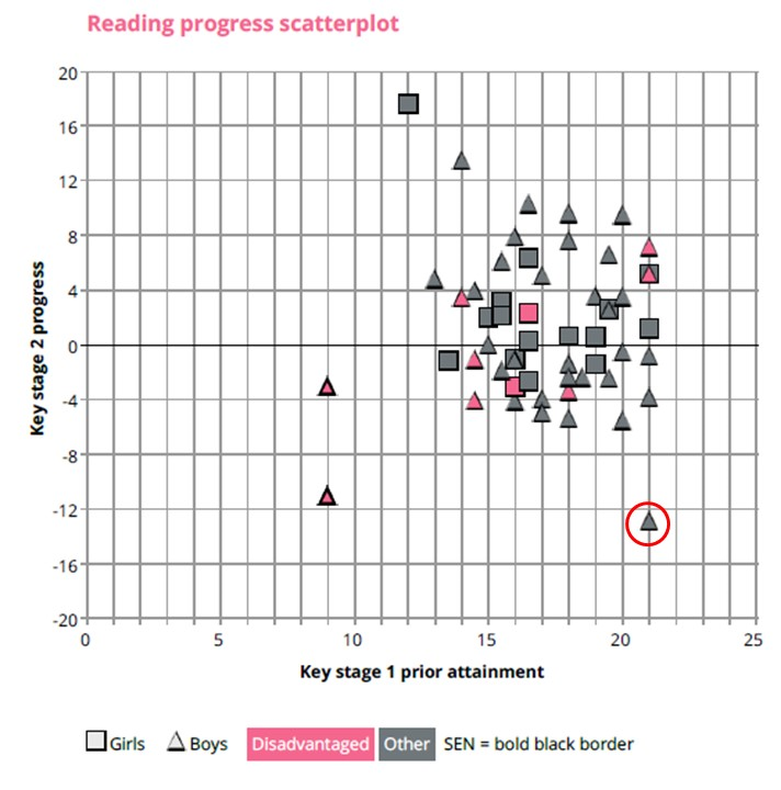
- Key Stage 1 Average Points Score going across, with a score of 12 to 17.99 representing your Middle Prior Attainers, and
- Pupils’ progress scores going up and down.
For example,
- the pupil who is circled has a Key Stage 1 Average Point Score of 21 – that’s level 3. For more details, please see our KS1 APS article.
- This Level 3 pupil got a progress score of approximately minus 13.
- This pupil, from the key at the bottom, is a non-disadvantaged boy who does not have SEN.
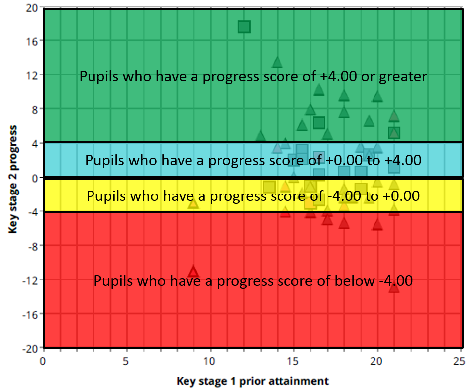
 How can you read these scatterplots? We generally divide them into 4 sections:
- The green section represents pupils who made much higher than expected progress.
- The blue section are pupils who were in line with National progress, but who made positive progress.
- The yellow section are those who were in line, but who made negative progress, i.e. not as much as their National counterparts, and
- The red section are those whose progress was very much below their National counterpart.
Why should you use a Progress scattergraph? One reason is that it gets away from a single figure for your school, and allows you to see your individual pupils.
Additionally, Ofsted are worried that one pupil’s exceptional schools can greater impact on a school’s performance, and so in Ofsted’s September newsletter 2017, they said
We would like to remind inspectors that a school’s progress score at Key Stage 2 … could be influenced by outliers. …
For primary school inspections, extreme outliers can be identified from the scatterplots in the IDSR.
This problem has been reduced in 2018 when each pupil’s progress score has been capped – see our KS2 Progress Calculations article.
Attainment Scatterplot

On the left-hand side of the screen there is an attainment scatterplot. There is:
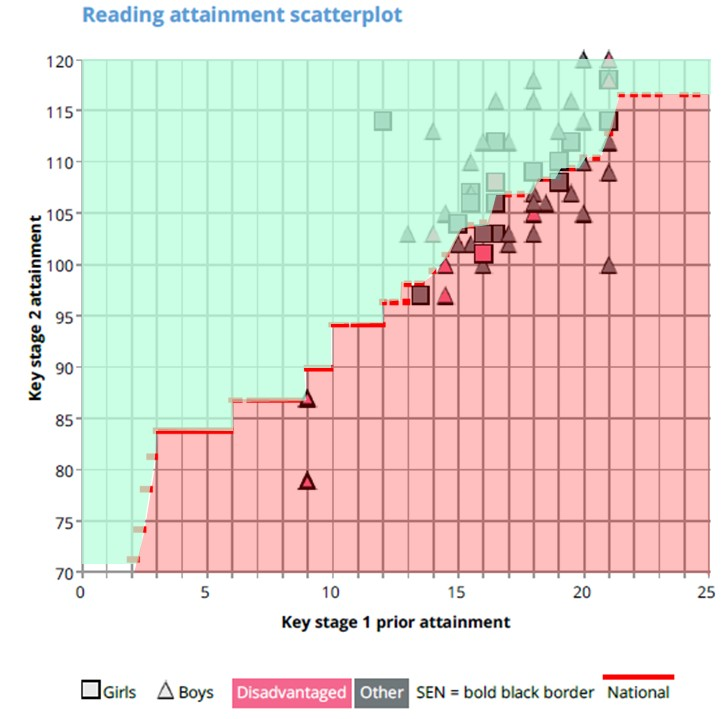
- the red line between National average, and
- pupils’ progress is represented by how far above that red line they are.
Additionally:
- those above the red line (in the green section) have positive progress, and
- those below (in the red section) have negative progress.
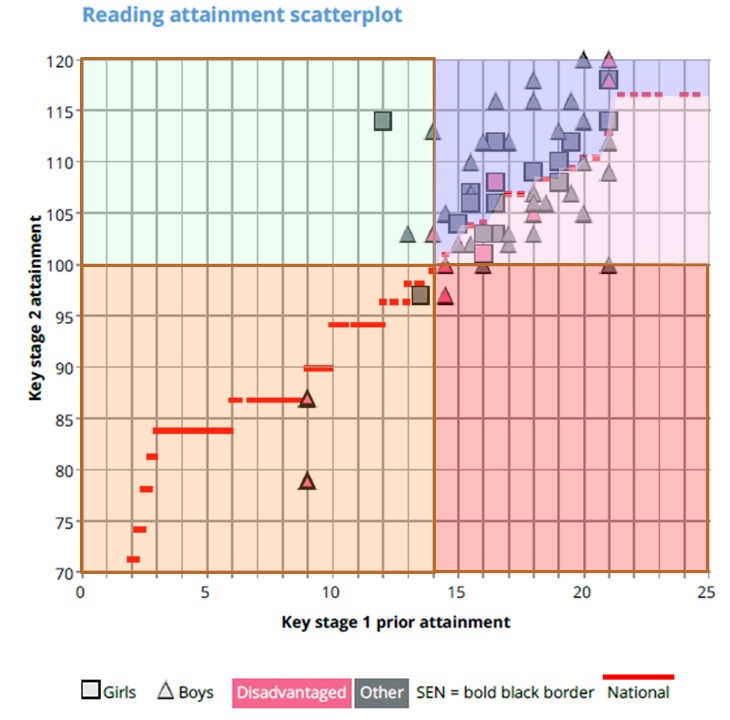
However, for a more particularised analysis, you can divide it into 5 different areas.

- The green area represents those pupils who had a scaled score above 100 – the pass mark – and who had a Key Stage 1 Prior Attainment of 14 or below (your level 2C pupils and your level 1 pupils). Based on their national counterparts, they were not expected to pass – yet they did. They also had positive progress – sometimes really positive progress.
- The orange area shows the other pupils who had a scaled score below 100. These pupils were not expected to pass, and they did not pass. However, they may have positive progress, depending on whether they were above or below the red line.
- The red area are pupils who were expected pass, but did not pass. They will have negative progress, and in the case of Level 3 pupils, a high negative progress.
- The remaining quadrant can be divided into two:
- The purple area, pupils above the red line, were expected to pass, did pass, and had positive progress.
- The pink area, pupils below the red line were expected to pass, did pass, but they didn’t make as much progress as their National counterparts.
In the next article in this series, we’ll have a look at the remaining pages of the IDSR from page 2 onwards, namely Characteristics, absence and Trends over time.