This series of articles will be looking at Ofsted’s Inspection Data Summary Report (IDSR).
In the previous articles, we had a look at the Key Stage 1 and Key Stage 2 attainment charts.
In this article, we’ll have a look at the Key Stage 2 progress charts.
Key Stage 2 Progress Charts

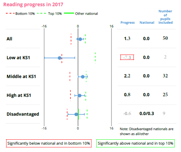
On the right-hand side is a typical progress chart – there is one for Reading, Writing and Maths.
There are 5 different types of cohort:
- All Pupils,
- Low Prior Attaining Pupils (pupils with a Key Stage 1 Average Point Score below 12),
- Middle Prior Attaining Pupils (a KS1 APS between 12 and 17.99), and
- High Prior Attaining Pupils (a KS1 APS of 18 or above), and
- Disadvantaged pupils.
More information about how your pupils’ Key Stage 1 is calculation can be found in our How is Key Stage 2 Progress calculated article.
The progress score for this school overall is +1.3.
What does that mean?
For each pupil:
- We look at their Scaled Score from their test or Teacher Assessment.
- We have a look at the National Average for all pupils who had a similar average point score, and
- We calculate how many Scaled Scores above or below the National Average your pupil was. This indicates your pupil’s individual progress.
- From 2018 onward, for pupils with a Key Stage 1 Average Point score of 6 or more, there is a minimum progress score for any individual. This varies between -27.50 and -10.56, depending on the subject and the Key Stage 1 Average Point Score.
The school’s progress score is the average progress score is the mean average of all of your school’s pupils who had a Key Stage 1 Average Point Score.
For more detail, please see our Key Stage 2 Progress Calculation article.
So, turning back to the above example, pupils in this school scored 1.3 Scaled Scores above their National counterparts, if their National counterparts had similar Key Stage 1 Average Point Score.
But you can also see that the school is:
- 7.3 Scaled Scores below for Key Stage 1 Low Prior Attaining pupils,
- 2.2 Scaled Scores above for Middle Prior Attaining pupils, and
- 0.8 Scaled Scores above for High Prior Attaining pupils.
Shapes used in the Key Stage 2 Progress charts

Now what do the shapes in the KS2 Progress charts mean?
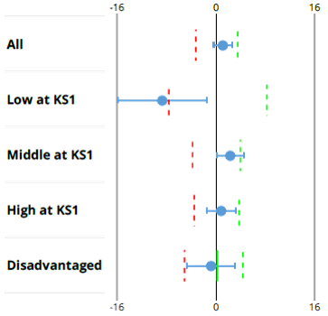
The dot in the centre is your school’s progress score.
This school is:
- to the right of the zero line for All, Middle and High Prior Attainers, representing positive progress, and
- to the left of the zero line for Low and Disadvantaged, representing negative progress (this indicates that this cohort made less than the progress of pupils throughout England with a similar prior attainment).
What do the horizontal lines represent?
They represent the confidence interval, and this gives Ofsted and others the confidence to say that your school is significantly above or significantly below the National average.
These lines are of different length.
For example, those for “Low Prior Attainers” is much longer than “All Pupils”.
What does the length of this line represent?
- The length of the line has nothing to do with your school’s progress score.
- It has nothing to do with how well your school did.
- It only has to do with your school’s cohort size, and the calculation is a number which is roughly 12 divided by the square root of the number of pupils.
So that explains why your Low Prior Attainment pupils has a much wider line than your All Pupils cohort.
In summary,
- the dot represents your school’s progress
- and the line represents the confidence interval.
In our next article, we’ll look at how they are used, and how important they are for your school.
This FREE training course is also Available for FREE as a video learning course on our YouTube Channel.
- Learn at your speed (can be paused and restarted)
- Use on the go (over internet)
- Great for School Governors and School Leaders
