This series of articles will be looking at Ofsted’s Inspection Data Summary Report (IDSR).
In the previous article in this series, we had a look at how Key Stage 2 progress is represented in the IDSR.

We saw that:
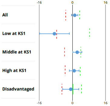
- The central dot represents your school’s progress score, and
- The line represents a calculation of the cohort’s confidence interval.
In this article, we’ll look at how Ofsted interprets this, and what significance it has to your school.
Key Stage 2 Progress Significance
So how do we interpret these shapes?
- If the entirety of these shapes, the dot and the line, is to the right of the zero line, then your school is, in old money, significantly above average.
- If it is entirely to the left of the zero line, then you are significantly below average.
- If it even just touches the line, and you see that the Middle Prior Attainers just touches the line, then you are neither significantly above, nor significantly below – you are in line with the National Average.
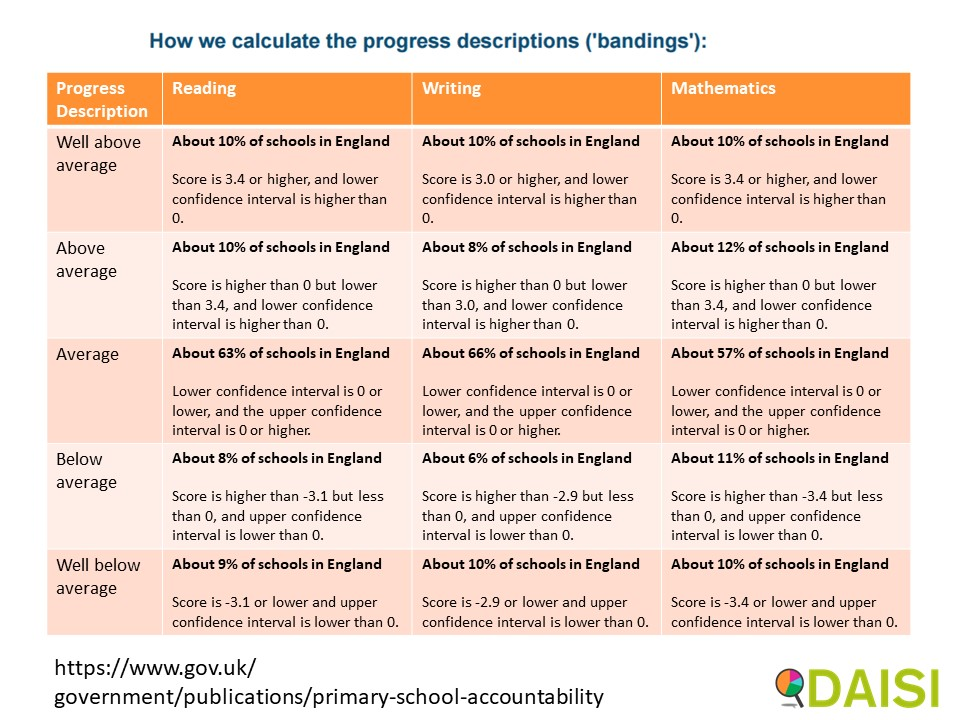
I say that this is old terminology, because nowadays there are not 3 but 5 categories for your school.

You may have seen these categories on the public Compare School Performance website.
You could be average, well above average, above average, below average, and well below average.
- If you are neither significantly above nor significantly below, then your school’s results will be in the third category: average. End of story.
- However, if you are
- significantly above or below AND
- you are in the bottom or top 10% of schools, and you see that it is approximately plus 3 or minus 3,
then you will be in the well above or well below average. If not, then you will be above average, the second category, or below average, the fourth category.
So how is that represented in the IDSR?

So you can see dashed green lines and dashed red lines going down.
- The dashed green lines represent the top 10% of schools.
- The dashed red lines represent the bottom 10% of schools.
So, we have 5 scenarios.
- First of all, your horizontal line touches the zero line. You are in the third category, average – end of story.
Now, forget about the line and concentrate solely on the dots.
- If it is to the right of the green dashed line, then you are in the first category, well above average.
- If it’s to the left of the dashed red line, then you are in the fifth category, well below average.
- If not that, then you will be in the second or fourth categories, above or below average, depending on whether your dot is above or below zero.

So hopefully that explains these categories, which are also used in the public Compare School Performance website.
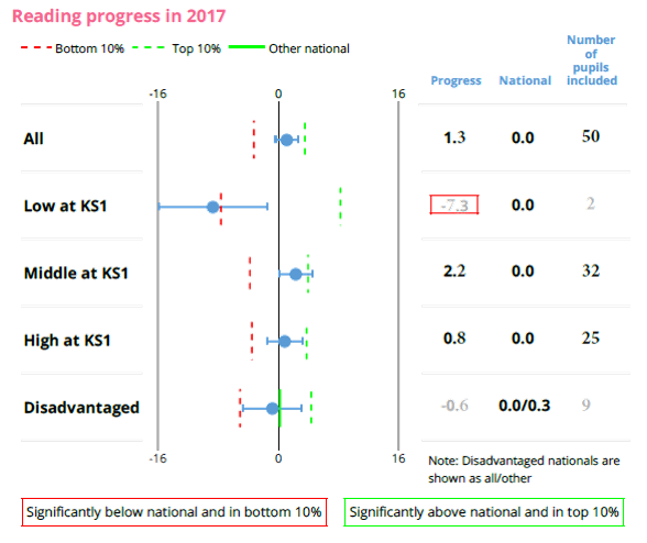
Looking at our example, our Low Prior Attaining pupils are significantly below, and in the bottom 10%. That’s why it’s got a red border around it. Of course, significantly below and in the bottom 10% means “Well below”. Similarly, significantly above and in the top 10% means – well above.
This school was very close to being above average for their Middle Prior Attainers – not well above average, as the dot is not to the right of the green dashed line.
As before, beware of making big judgements based on small cohorts. I wouldn’t consider the results for these Low Prior Attaining pupils, because they are less than 6 of them, and I would only consider the Disadvantaged pupils, which are in line with the National average, if I was looking at more than one year, because there are between 6 and 10 of them.
In the next article in this series, we’ll have a look at the Key Stage 2 scattergraphs in the IDSR, and how they can be used.
This FREE training course is also Available for FREE as a video learning course on our YouTube Channel.
- Learn at your speed (can be paused and restarted)
- Use on the go (over internet)
- Great for School Governors and School Leaders
