
This series of articles will be looking at Ofsted’s Inspection Data Summary Report (IDSR).
In the previous articles in this series, we had a look at EYFSP, Phonics, Key Stage 1 and 2 Attainment, Key Stage 2 Progress and Scattergraphs.
In this article, we’ll have a look at the remaining pages in the IDSR, pages 2 to 4.
Key Stage 2 Trends over time
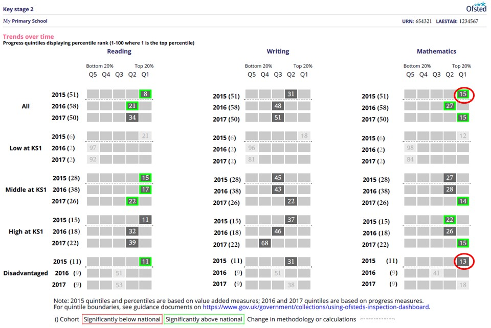
Page 4 of your IDSR shows how your school has done compared to other schools over time.
This shows a percentile ranking, from 1 to 100.
- A “1” means that you are in top 1% of schools, and
- a “100” means that you are in the bottom 1% of schools.
Again, figures are greyed out if the cohort size is under 11, as Ofsted will not use results from such a small cohort size in isolation. But beware – if your cohort size is between 6 and 10, then Ofsted may use this data if they are looking at trends.
Additionally, figures have a green box if they are significantly above average, and red if they are significantly below.
This does not mean that results with a green box has a higher rank than one without. There are two circled figures in this example.
- In 2015 for all pupils, this school was in the top 15% of schools and was significantly above average, whereas
- the disadvantaged pupils were in the top 13% of schools, but due to the reduced cohort size, they were not significantly above average.
For a discussion on varying confidence intervals, please see our Key Stage 2 Progress article.
For information about how your pupils are categorised into Low, Middle and High Prior attaining pupils, please see our How Key Stage 2 Progress is Calculated? article.
Absence and exclusions data
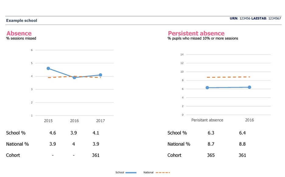
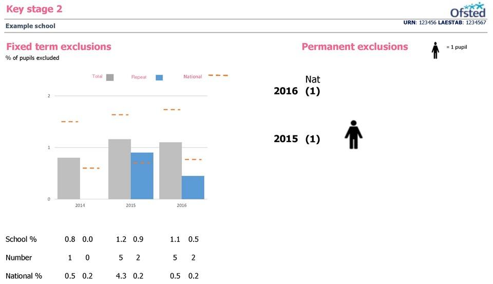
Paragraph 179 of Ofsted’s School Inspection Handbook says (emphasis added):
179. Inspectors will consider:
overall absence and persistent absence rates for all pupils, and for different groups in relation to national figures for all pupils
the extent to which low attenders are improving their attendance over time and whether attendance is consistently low (in the lowest 10%)
Unfortunately, the charts shown in the IDSR have significantly less information that the previous Inspection Dashboard, and therefore we cannot recommend using these graphs at more than a basic level.
Instead, we would suggest that you use your ASP report instead.
Characteristics
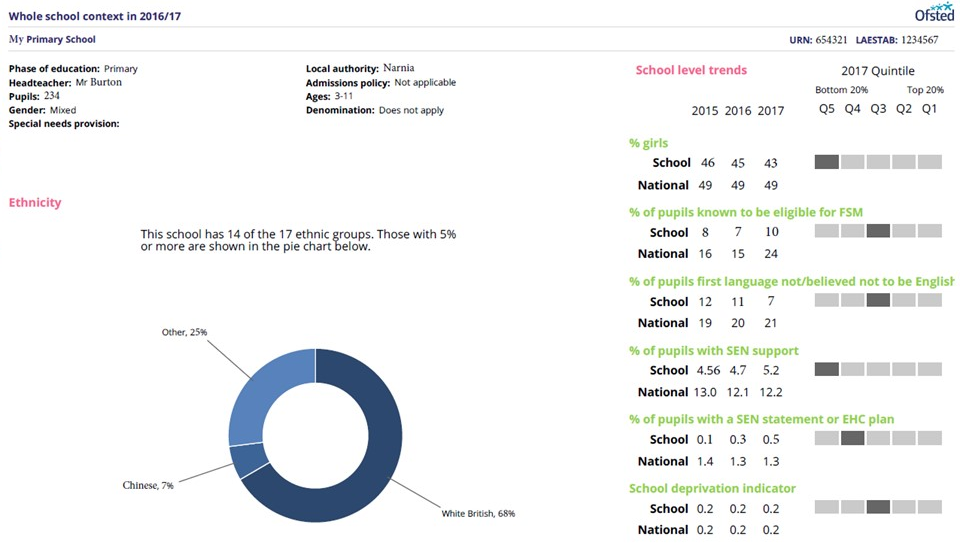
Pages 2 and 3 are about the characteristics of your school.
This is because when Ofsted comes calling at your school, they don’t know what your school is like. They don’t know how many pupils there are, or other characteristics.
Page 2 shows various things about your school, including that which used to be in your RAISEonline Summary Report.
Most of them are fairly self-explanatory. “School Deprivation Index” is another name for IDACI, Income Deprivation Affecting Children Index. This measures the proportion of children under the age of 16 that live in low income households.
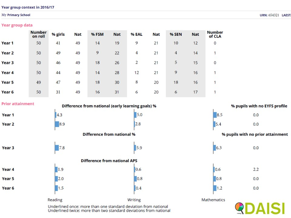
Page 3 shows some of this information by year (percentage of girls, FSM, EAL, SEN and Children Looked After). It is this final column, number of Looked After Children, that makes us caution you against putting the IDSR on your school website or any other public place.
It also shows how your pupils had achieved in their previous assessment, either at Early Years or at Key Stage 1. This analysis takes account of pupils who have recently arrived at your school or recently left your school.
You will see that last year’s Year 1 were above the National Average for Reading, Writing and Maths, and in some cases well above. So this just puts your school into context for Ofsted’s inspectors.
In our final article in this series, we have a look at Page 1 of your IDSR, namely the “Areas to Investigate” section.
This FREE training course is also Available for FREE as a video learning course on our YouTube Channel.
- Learn at your speed (can be paused and restarted)
- Use on the go (over internet)
- Great for School Governors and School Leaders
